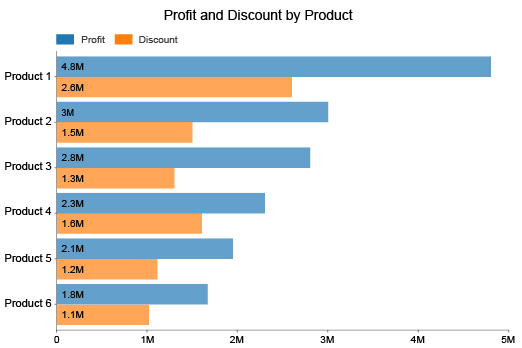
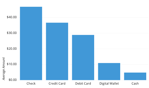
Bar Chart in Project Management

What is a Bar Chart? A Bar Chart, also known as a Bar Graph, is a visual representation of data using rectangular bars. The height or length of each bar is proportional to the value it represents. Bar Charts are commonly used to compare data across different categories or time periods.
Pros of Bar Charts:
- Easy to understand: Bar Charts are simple and easy to understand, making them a popular choice for presenting data to non-technical audiences.
- Versatile: Bar Charts can be used to display a wide range of data types, including categorical and numerical data.
- Effective for comparing data: Bar Charts make it easy to compare data across different categories or time periods, which can help project teams to identify trends and patterns in the data.
Cons of Bar Charts:
- Limited ability to show trends: While Bar Charts are effective for comparing data across categories or time periods, they may not be as effective for showing trends over time.
- Limited ability to show relationships: Bar Charts may not be as effective at showing relationships between different data points, which can make it difficult to draw conclusions about cause and effect.
- Can be oversimplified: In some cases, Bar Charts may oversimplify complex data sets, which can lead to misinterpretation or misunderstanding of the data.