Blogs

PERT Chart - The Most Popular Project Management Diagram

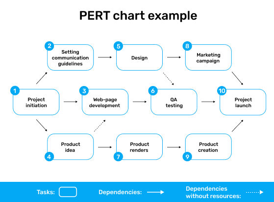
What is a PERT Chart? A PERT (Program Evaluation and Review Technique) Chart is a project management tool that provides a graphical representation of a project's timeline. It shows the dependencies between tasks and the critical path of the project, which is the sequence of tasks that must be completed on time in order for the project to be completed on schedule.

Pros of a PERT Chart:

  • Helps to identify critical path: A PERT Chart is particularly useful for identifying the critical path of a project, which is the sequence of tasks that must be completed on time in order for the project to be completed on schedule. This helps project managers to focus on the most important tasks and allocate resources accordingly.
  • Allows for scheduling and resource allocation: By providing a clear understanding of the project schedule and dependencies, a PERT Chart allows project managers to effectively allocate resources and ensure that tasks are completed on time.
  • Facilitates communication: A PERT Chart can be shared with all team members and stakeholders, which facilitates communication and transparency throughout the project.

Cons of a PERT Chart:

  • Can be time-consuming: Creating a PERT Chart can be a time-consuming process, especially for large and complex projects. This may be challenging for project managers who are working under tight deadlines.
  • May be too complex for small projects: While a PERT Chart is an effective tool for managing large, complex projects, it may be too complex and time-consuming for smaller projects that require less planning and oversight.
  • Can be difficult to adjust: Making changes to a PERT Chart can be challenging, especially if the project has already begun. This can lead to delays and may make it difficult to adapt to changing circumstances.

Related Posts

What is Cumulative Flow Project Chart

A Cumulative Flow Project Chart is a visual representation of the flow of work in a project or process over time. It is a useful tool for monitoring and analyzing the progress of work and identifying areas where improvements can be made. The pros of using a Cumulative Flow Project Chart ...

Kanban Board - Agile Project Chart

What is a Kanban Board? A Kanban Board is a visual tool used to manage workflow in an Agile project. It consists of a board with columns representing different stages of the workflow, and task cards representing individual work items. As tasks move through the workflow, they are moved from one co...

Gantt Chart - Roadmap Project Chart

A Gantt Chart is a visual tool used to manage project schedules. It displays a timeline of the project along with the various tasks that need to be completed and the duration of each task. It also shows the dependencies between tasks, which allows project managers to see how one task affects anot...

What is a Timeline View in Project Management?

A Timeline View is a visual tool used to manage project timelines. It displays a timeline of the project along with the various tasks that need to be completed and the duration of each task. Unlike a Gantt Chart, which displays task dependencies, a Timeline View focuses solely on the timing of ta...

Work-Breakdown Structure (WBS) Chart

What is a Work Breakdown Structure (WBS)? A Work Breakdown Structure (WBS) is a project management tool used to break down a project into smaller, more manageable components. It involves dividing the project into smaller, more manageable tasks or work packages, which are then broken down into eve...

Flowchart in Project Management

What is a Flowchart? A Flowchart is a graphical representation of a process or workflow that uses symbols and arrows to show the steps involved in completing a task or achieving a goal. It is a visual tool that allows users to see the flow of a process and to identify potential problems or areas ...

Cause-Effect Project Charts - Fishbone Diagram

What is a Cause-Effect Project Chart? A Cause-Effect Project Chart is a graphical representation of the possible causes of a problem or outcome. It is often used in project management to identify the root cause of a problem, which can help project teams to develop effective solutions. Pr...

Burn-up and Burn-down Project Charts

What are Burn-up and Burn-down Project Charts? Burn-up and Burn-down Project Charts are graphical representations of the progress of a project over time. Both charts show how much work has been completed over time and how much work is remaining. The main difference between the two charts is how t...

Bar Chart in Project Management

What is a Bar Chart? A Bar Chart, also known as a Bar Graph, is a visual representation of data using rectangular bars. The height or length of each bar is proportional to the value it represents. Bar Charts are commonly used to compare data across different categories or time periods. ...

What is Pie Chart

A pie chart is a circular graph used to represent data, where the size of each wedge is proportional to the quantity it represents. The chart is divided into slices, each representing a portion of the whole. Pie charts are commonly used to show percentages or proportions of a whole, and are usefu...