Blogs

What is Control Chart

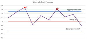
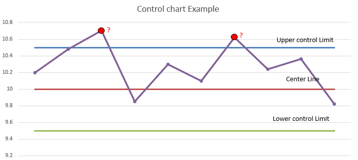
A Control Chart is a statistical tool that is used to monitor a process or system over time and detect any changes in its performance. It is a graphical representation of the process data, with the average value and the upper and lower control limits plotted on the chart.

The pros of using a Control Chart include:

  1. It provides a visual representation of the process data, which helps in identifying any patterns or trends in the data.

  2. It helps in detecting any changes in the process performance, which may indicate the need for corrective action.

  3. It provides a tool for continuous improvement, by allowing the process to be monitored and adjusted as necessary.

  4. It helps in reducing variability and improving quality, by identifying sources of variation in the process.

The cons of using a Control Chart include:

  1. It can be difficult to interpret the chart without a basic understanding of statistical concepts and methods.

  2. It may not be suitable for all types of processes or systems, as some processes may not have a natural mean or may be too complex to monitor using a control chart.

  3. It requires a significant amount of data to be collected and analyzed, which may be time-consuming and costly.

  4. It may not be effective in detecting small changes in the process performance, as the control limits may be too wide to detect subtle variations.

Related Posts

PERT Chart - The Most Popular Project Management Diagram

What is a PERT Chart? A PERT (Program Evaluation and Review Technique) Chart is a project management tool that provides a graphical representation of a project's timeline. It shows the dependencies between tasks and the critical path of the project, which is the sequence of tasks that must be com...

What is Cumulative Flow Project Chart

A Cumulative Flow Project Chart is a visual representation of the flow of work in a project or process over time. It is a useful tool for monitoring and analyzing the progress of work and identifying areas where improvements can be made. The pros of using a Cumulative Flow Project Chart ...

Kanban Board - Agile Project Chart

What is a Kanban Board? A Kanban Board is a visual tool used to manage workflow in an Agile project. It consists of a board with columns representing different stages of the workflow, and task cards representing individual work items. As tasks move through the workflow, they are moved from one co...

Gantt Chart - Roadmap Project Chart

A Gantt Chart is a visual tool used to manage project schedules. It displays a timeline of the project along with the various tasks that need to be completed and the duration of each task. It also shows the dependencies between tasks, which allows project managers to see how one task affects anot...

What is a Timeline View in Project Management?

A Timeline View is a visual tool used to manage project timelines. It displays a timeline of the project along with the various tasks that need to be completed and the duration of each task. Unlike a Gantt Chart, which displays task dependencies, a Timeline View focuses solely on the timing of ta...

Work-Breakdown Structure (WBS) Chart

What is a Work Breakdown Structure (WBS)? A Work Breakdown Structure (WBS) is a project management tool used to break down a project into smaller, more manageable components. It involves dividing the project into smaller, more manageable tasks or work packages, which are then broken down into eve...

Flowchart in Project Management

What is a Flowchart? A Flowchart is a graphical representation of a process or workflow that uses symbols and arrows to show the steps involved in completing a task or achieving a goal. It is a visual tool that allows users to see the flow of a process and to identify potential problems or areas ...

Cause-Effect Project Charts - Fishbone Diagram

What is a Cause-Effect Project Chart? A Cause-Effect Project Chart is a graphical representation of the possible causes of a problem or outcome. It is often used in project management to identify the root cause of a problem, which can help project teams to develop effective solutions. Pr...

Burn-up and Burn-down Project Charts

What are Burn-up and Burn-down Project Charts? Burn-up and Burn-down Project Charts are graphical representations of the progress of a project over time. Both charts show how much work has been completed over time and how much work is remaining. The main difference between the two charts is how t...

Bar Chart in Project Management

What is a Bar Chart? A Bar Chart, also known as a Bar Graph, is a visual representation of data using rectangular bars. The height or length of each bar is proportional to the value it represents. Bar Charts are commonly used to compare data across different categories or time periods. ...