Blogs
- Project Management Terms
- Agile - The Definition of Continuous Change
- Servant Leadership - A Key Leadership Style in Agile
- 6 Steps to making reasonable decisions
- What is the BOSCARD method
- PEST Analysis: How Political, Economic, Social, and Technological Factors Impact Your Business
- 49 Processes in Project Management
- What is Aggregate Planning in Project Management?
- 25 PMP Formulas you must remember to pass the PMP exam
- Example with formulas Earned Value, Cost Variance and Schedule Variance
- Example with formular Cost Performance Index (CPI), Schedule Performance Index (SPI) and Estimate at Completion (EAC)
- Example with formulas Beta Value in PERT, Expected Monetary Value (EMV) and Risk Priority Number
- Example with formular Variance at Completion, Estimate to Complete (ETC) and To Complete Performance Index (TCPI)
- Example with formular Standard Deviation, Communication Channels and Cost plus Percentage of Cost
- Example with formular Cost plus Fixed Fee, Cost plus Award Fee and Cost plus Incentive Fee
- Example with formular Return on Investment (ROI), Payback Period and Cost Benefit Ratio
- Example with formular Present Value (PV), Future Value (FV), Target Price and Point of Total Assumption
- Kanban Board - Agile Project Chart
- Gantt Chart - Roadmap Project Chart
- What is a Timeline View in Project Management?
- PERT Chart - The Most Popular Project Management Diagram
- Work-Breakdown Structure (WBS) Chart
- Flowchart in Project Management
- Cause-Effect Project Charts - Fishbone Diagram
- Burn-up and Burn-down Project Charts
- Bar Chart in Project Management
- What is Pareto Chart
- What is Pie Chart
- What is Control Chart
- What is Matrix Diagram
- What is Critical Path Diagram
- What is Cumulative Flow Project Chart
- What is Enterprise Environmental Factors
- What is Arrow Diagramming Method (ADM)
- What is Cost Baseline
- What is Cost-Benefit Analysis
- What is Cost Engineering?
- What is Cost Management Plan
- What is Cost of Quality?
- What is Cost Overrun?
- What is Cost Performance Index?
- What is Cost Plus Fixed Fee Contract?
- What is Cost Plus Incentive Fee Contract?
- What is Cost Plus Percentage Of Cost Contract
- What is Cost Reimbursable Contract?
What is Pareto Chart
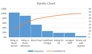
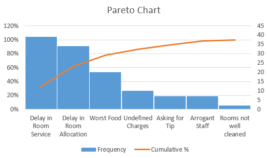
What is a Pareto Chart? A Pareto Chart is a graphical representation of data that displays the relative frequency or size of problems in descending order of importance. It is based on the Pareto principle, which states that roughly 80% of effects come from 20% of causes. Pareto Charts are commonly used in quality control and project management to identify and prioritize issues or opportunities for improvement.
Pros of Pareto Charts:
- Easy to understand: Pareto Charts are simple and easy to understand, making them a popular choice for presenting data to non-technical audiences.
- Effective for prioritizing issues: Pareto Charts help project teams to identify and prioritize issues or opportunities for improvement by highlighting the most significant factors contributing to a problem.
- Can be used with a wide range of data types: Pareto Charts can be used with a wide range of data types, including categorical and numerical data.
Cons of Pareto Charts:
- May not identify root causes: While Pareto Charts help to identify and prioritize issues, they may not identify the underlying root causes of a problem, which can make it difficult to develop effective solutions.
- May oversimplify complex issues: In some cases, Pareto Charts may oversimplify complex issues by focusing too much on the top few contributing factors and ignoring other important factors that may be less significant but still contribute to the problem.
- May require additional analysis: Pareto Charts may require additional analysis to fully understand the data and to develop effective solutions, which can be time-consuming and resource-intensive.
Related Posts
PERT Chart - The Most Popular Project Management Diagram
What is a PERT Chart? A PERT (Program Evaluation and Review Technique) Chart is a project management tool that provides a graphical representation of a project's timeline. It shows the dependencies between tasks and the critical path of the project, which is the sequence of tasks that must be com...
What is Cumulative Flow Project Chart
A Cumulative Flow Project Chart is a visual representation of the flow of work in a project or process over time. It is a useful tool for monitoring and analyzing the progress of work and identifying areas where improvements can be made. The pros of using a Cumulative Flow Project Chart ...
Kanban Board - Agile Project Chart
What is a Kanban Board? A Kanban Board is a visual tool used to manage workflow in an Agile project. It consists of a board with columns representing different stages of the workflow, and task cards representing individual work items. As tasks move through the workflow, they are moved from one co...
Gantt Chart - Roadmap Project Chart
A Gantt Chart is a visual tool used to manage project schedules. It displays a timeline of the project along with the various tasks that need to be completed and the duration of each task. It also shows the dependencies between tasks, which allows project managers to see how one task affects anot...
What is a Timeline View in Project Management?
A Timeline View is a visual tool used to manage project timelines. It displays a timeline of the project along with the various tasks that need to be completed and the duration of each task. Unlike a Gantt Chart, which displays task dependencies, a Timeline View focuses solely on the timing of ta...
Work-Breakdown Structure (WBS) Chart
What is a Work Breakdown Structure (WBS)? A Work Breakdown Structure (WBS) is a project management tool used to break down a project into smaller, more manageable components. It involves dividing the project into smaller, more manageable tasks or work packages, which are then broken down into eve...
Flowchart in Project Management
What is a Flowchart? A Flowchart is a graphical representation of a process or workflow that uses symbols and arrows to show the steps involved in completing a task or achieving a goal. It is a visual tool that allows users to see the flow of a process and to identify potential problems or areas ...
Cause-Effect Project Charts - Fishbone Diagram
What is a Cause-Effect Project Chart? A Cause-Effect Project Chart is a graphical representation of the possible causes of a problem or outcome. It is often used in project management to identify the root cause of a problem, which can help project teams to develop effective solutions. Pr...
Burn-up and Burn-down Project Charts
What are Burn-up and Burn-down Project Charts? Burn-up and Burn-down Project Charts are graphical representations of the progress of a project over time. Both charts show how much work has been completed over time and how much work is remaining. The main difference between the two charts is how t...