Burn-up and Burn-down Project Charts

What are Burn-up and Burn-down Project Charts? Burn-up and Burn-down Project Charts are graphical representations of the progress of a project over time. Both charts show how much work has been completed over time and how much work is remaining. The main difference between the two charts is how they depict progress - Burn-up charts show the total amount of work completed over time, while Burn-down charts show the remaining work over time.
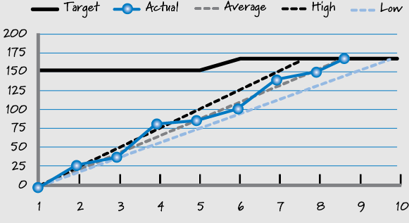
Burn-up chart
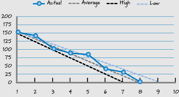
Burn-down chart
Pros of Burn-up and Burn-down Project Charts:
- Provides a clear understanding of project progress: Both Burn-up and Burn-down charts provide a clear and visual understanding of the progress of a project, which can help project teams to identify potential issues and to adjust their plans accordingly.
- Facilitates communication: Burn-up and Burn-down charts can be easily shared with all team members and stakeholders, which facilitates communication and transparency throughout the project.
- Helps with tracking progress: Both Burn-up and Burn-down charts help project teams to track progress against the planned timeline and to adjust their plans if necessary.
Cons of Burn-up and Burn-down Project Charts:
- Can be overly simplistic: Burn-up and Burn-down charts may not capture all of the complexities of a project, which can make it difficult for project teams to fully understand the progress of the project.
- May not account for unforeseen events: Burn-up and Burn-down charts may not account for unforeseen events that can impact the progress of a project, such as changes in scope or unexpected delays.
- Can be misleading: Burn-up and Burn-down charts can be misleading if not properly interpreted. For example, a team may complete a large amount of work early in the project, which may make it appear as if the project is ahead of schedule, but if subsequent work takes longer than anticipated, the project may still end up being behind schedule.